
New interactive map of SA election results
Five years ago, after the 2014 general election, I built an interactive map of the election results. Since then the state of the technology for web mapping has moved on, so I’ve developed a completely new version. This new map uses vector tiles for better rendering, includes results for four general elections (2004–2019), and allows you to drill all the way down to voting district level. And here it is.
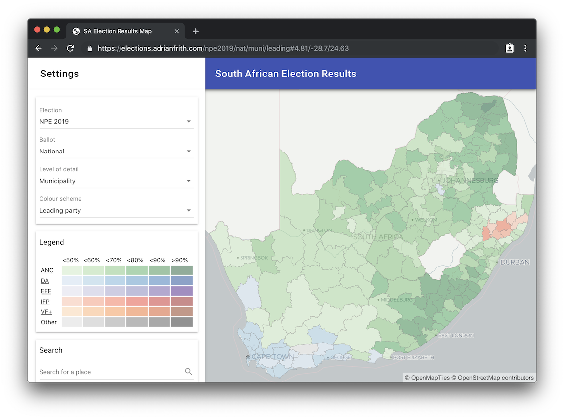
The map allows you to look at five levels of electoral geography (province, district council, municipality, ward and voting district), and at the national or provincial ballots. There are several colour schemes to choose from: leading party (as seen in the screenshot), turnout percentage, and support levels for five major political parties. If you click or tap on an area on the map, a popup opens with full details of the election result in that area. You can search for an address to zoom to that location. The site is responsive and works on smartphones and tablets (although it may be slow on older devices).
Technical details
The election result data and the boundaries of the electoral geographies are stored in a PostgreSQL database with the PostGIS extensions. The map is produced from tiles in the Mapbox Vector Tile format, which are served by a Node.js service that uses the TileStrata library (slightly modified by me). The service also provides an endpoint to look up the full result details for the popup display.
The website itself is coded in Javascript using React and react-md. The map uses Mapbox GL JS with the react-mapbox-gl wrapper. The whole lot is deployed on my server using the amazing Dokku.
The code is all available on GitHub: frontend here and backend here.